MODERNIZING THE BRAND
Shutterfly is a 20+ year company known primarily for customer-built photo books and other designed goods. In a saturated market, they found themselves losing relevancy, their new customer growth slowing. One of the strategies for change was reinventing the look and feel of the Brand.
Shutterfly Brand Transformation
Role: Art Director, Systems Team Leader
Core Design Partners: Christina King, Ravina Dighe, Jessi Jurries
GOALS:
Transform the brand expression to meet shifting customer targets, define rules and guidelines for using the new brand elements, and govern the brand expression across channels.
INSIGHTS:
The new look and feel needed to attract a new audience segment while not alienating the core. The new Brand Transformation work would launch in Q4, and so it was incredibly important to define our iterative design process from the beginning.
SUCCESSES:
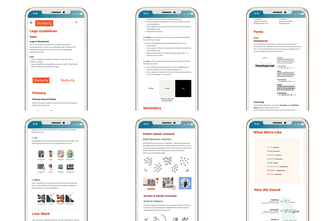
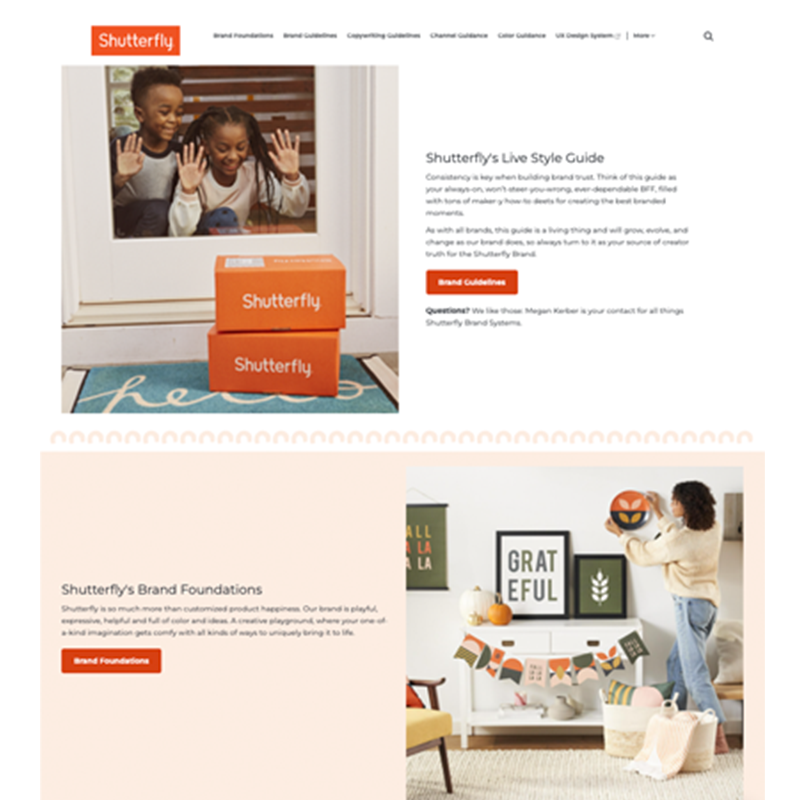
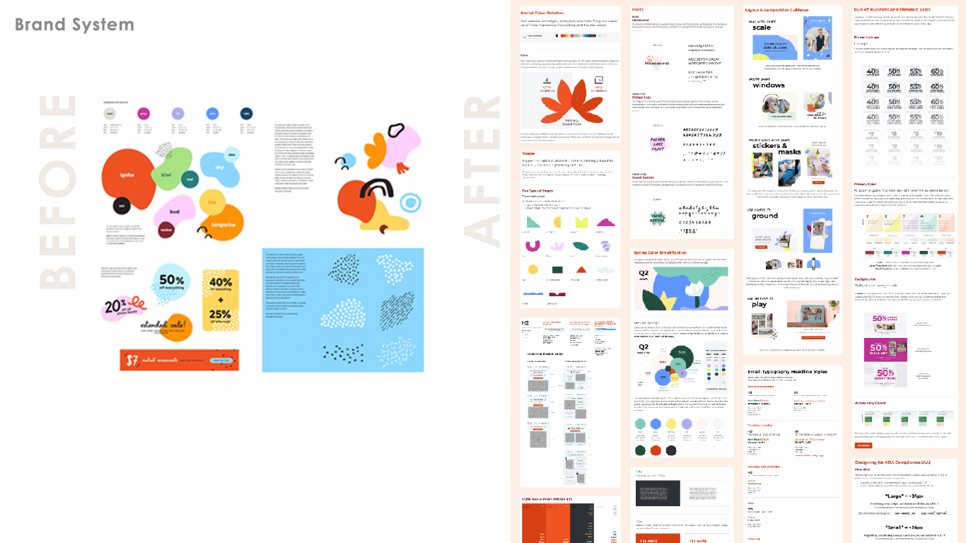
The “maker” was defined as the overarching persona that resonated with both audience segments, and so we built a robust brand system of expressive typography, hand-drawn linework, organic shapes and intentional pops of color to support our product stories. Once we developed the base of the brand, we released it to our design team with basic guidelines. We continued to evolve and refine that base, and add to it, with each iterative release. We housed all our guidelines in the Live Style Guide that we stood up and maintained so our teams had a source of truth during this rebrand.

I lead the build, launch and creative direction of Shutterfly’s 1st ever Live Style Guide, and managed the Brand Systems team responsible for content and governance.
My team's work kicked off with a mood board from our agency partners that reflected the visual territory our customers reacted most favorably to. We studied the research and customer insights and began to build out colors (adjusting for ADA accessibility with white and gray type), shapes, linework, and typography elements. We set guidelines for how they should be used and how they work together. We built reusable content and templates with this new system to enable our designers to create confidently and efficiently with the new elements. We did all of this in 3 quarters!
Through the insights that we studied, we learned that our customers come to the mobile and desktop sites for very different reasons, discovery vs creation. We partnered with our site team, UX team, and marketing leaders to understand how to best speak to those customer intentions. The teams were successful in defining each site component's purpose (promotional, inspirational, educational) and building templates and rules to govern their look and feel.
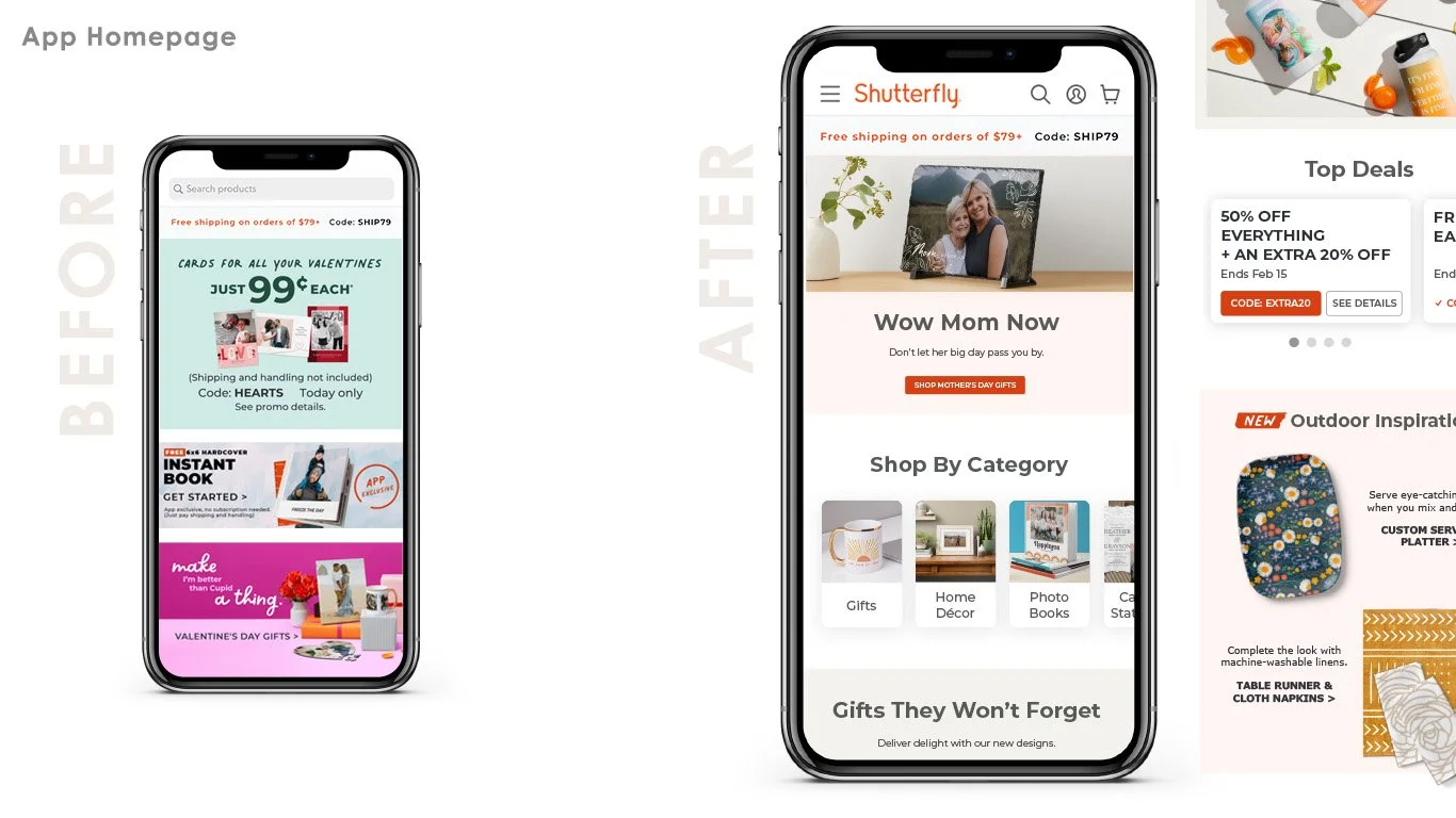
The mobile site and the app both needed to be tailored to encourage discovery. We worked with the site, app, and UX teams to define a modern and hierarchical system. Messaging, as well as promo and merch priorities, often shift... Our biggest accomplishments were guiding a getting type out of images and into live text to enable message customization and faster builds.
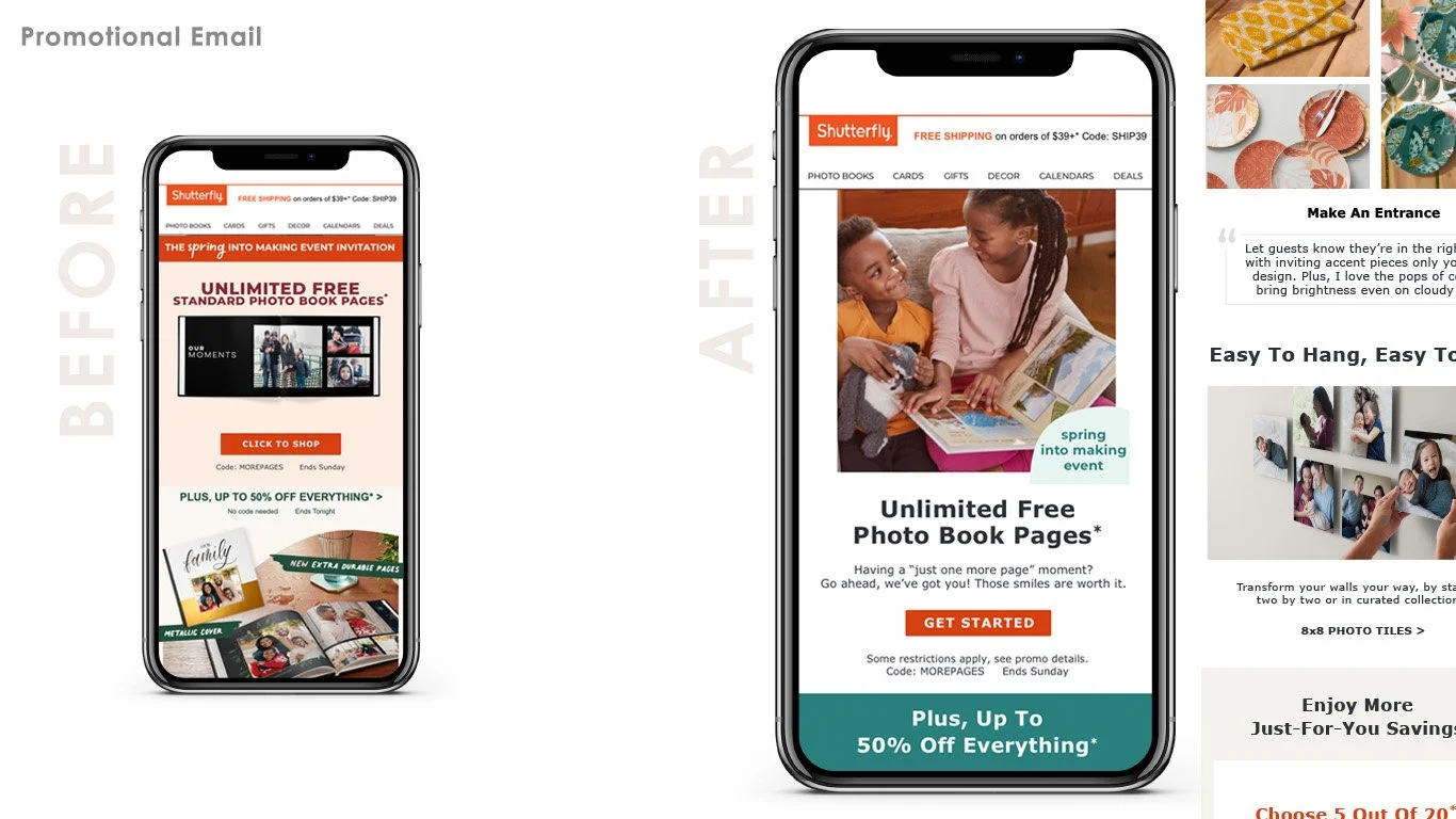
Shutterfly was and continues to be a promotionally driven brand. Our problem to solve was how to communicate more than just the promotion without losing it in the visual mix. We partnered with the CRM team and engineers to build new modular templates prioritizing live type, inspirational imagery and a tighter color story. We updated our web-safe font, we defined H1-H5 for type styles, we aligned button styles to site, we defined hero modules, secondary modules, and recovery module layouts, and we documented all of the guidelines in the Live Style Guide.
As part of the team's goal to amplify content outside of promotional offers, we defined an editorial design style, created reusable components, and build a library of templates for editorial emails. Previously, these emails had been completely image-based, which caused ADA and quality issues. Shifting to a modular, templated email structure improved hierarchy, created a predictable and comfortable scrolling experience, and enable us to tell stories like never before.
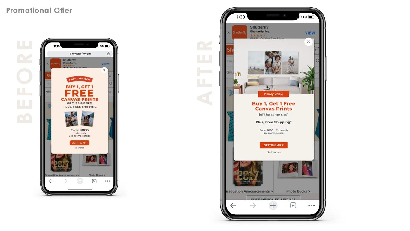
Our m-dot blockers were so promotion-heavy and dense in their design, they were often closed out without customers registering or retaining the information. We partnered with our promo designers and marketing leaders to redesign this experience to better serve our customers. We introduced a large lifestyle image component featuring the product in an inspirational way and discontinued the use of complex type lockups. We moved to a highly readable live-type style, defined a consistent color palette for promotions from our core brand palette, and created reusable templates for our designers to leverage, increasing efficiency and massively reducing time between kick-off and hand-off. We also succeeded in creating a consistent promotional experience for the customer for the first time, increasing readability, speed of message retention, and inspirational content to drive conversion.
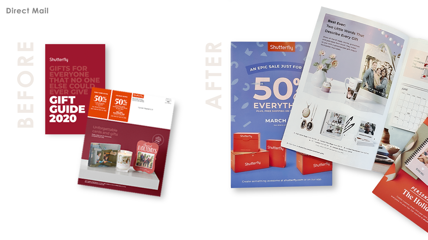
Our work on the new brand system along with the work from our partners in photography had a huge effect on Direct Mail. By prioritizing inspirational imagery and human interaction with our product, we elevated the stories in our promotional mailers and seasonal catalogs and brought inspiration to our customers. The introduction of a defined, robust color palette, hand-drawn linework, grounding shapes, and image cutouts created a comfortable and delightful flow between spreads and encouraged cover-to-cover reading.


