BRAND IN
HAND
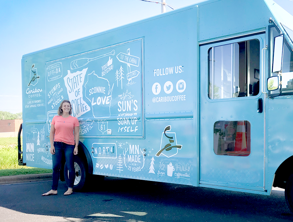
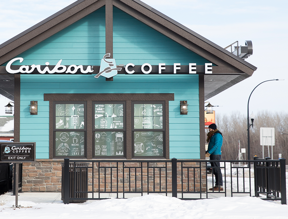
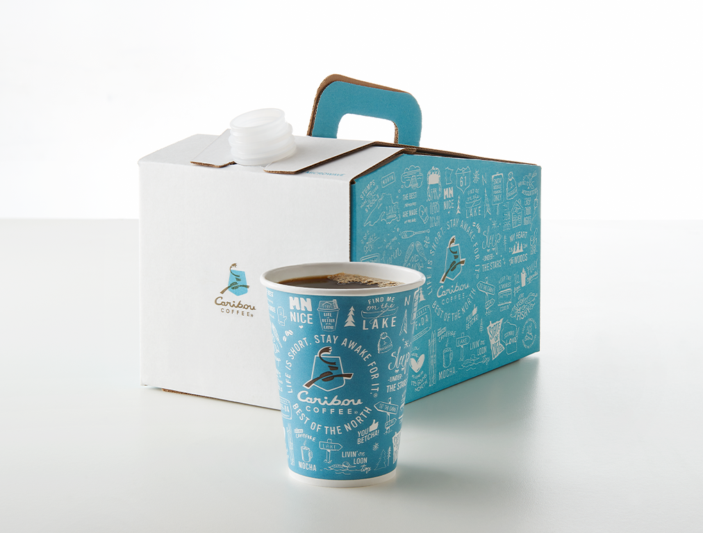
Lead concept, designed illustrations and managed production of original creative into an array of brand touchpoints including store designs, window installations, a mobile food truck, and the Caribou suite of packaging.
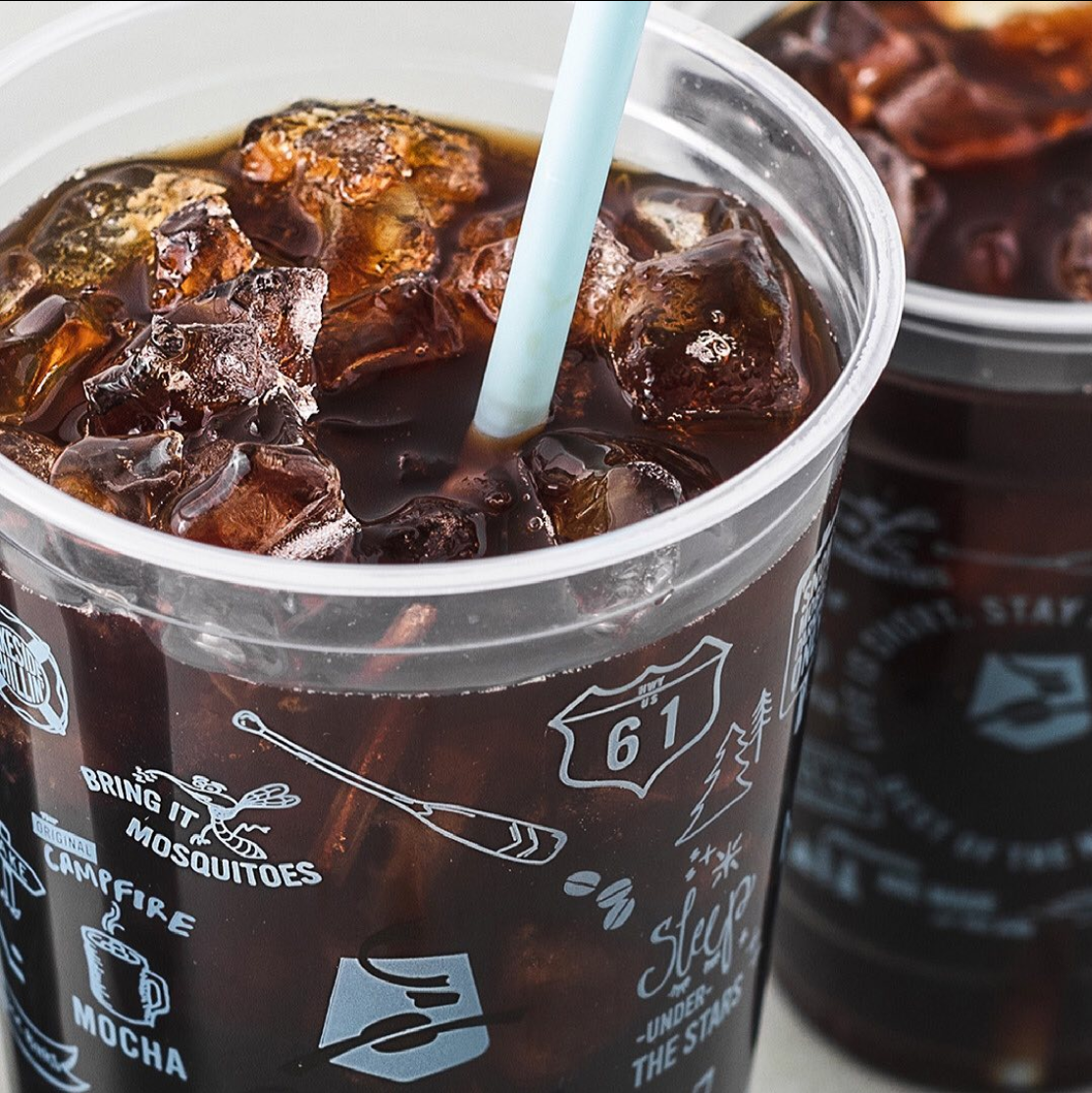
Caribou “Bou-isms” Packaging
Role: Senior Designer
Core Design Partners: Marc Shapiro, Libby Anderson, Jes Lahay
GOALS:
Shine a light on Caribou's heritage, up-north roots, and playful voice. Connect to what the core consumer loves about the Northern way of life. Create an authentic and relatable design that leans heavily into an element of discovery and adventure.
INSIGHTS:
We wanted to champion the "Best of the North" while also leaving room for outer-markets to relate to the design, knowing these cups would go to the full system of stores across the country.
SUCCESSES:
The insanely short deadline generated a massive sprint effort for me and my team, which allowed us to focus, collaborate, and be 100% dedicated to the creative project at hand, which for an internal creative team, is rare. It's still one of the infamous stories we like to dramatically retell today. Because of our diverse backgrounds, our team was able to illustrate "Bou-isms" (Caribou phrases indicative of our core values) that were immediately recognizable to our core consumer, while also resonating outside our home market. We saw increased social engagement through user generated posts and stories featuring the cup or a phrase on it. We saw store teams illustrate their own "Bou-isms" in their stores' chalk walls, and encourage guests to do the same. This has been Caribou's longest-running cup design to date.


